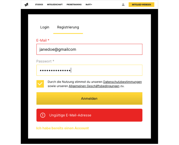
McFIT Website (mcfit.com), as of: December 13, 2024
Accessibility
Redesign of the McFIT online registration form.
BACKGROUND: For people with visual impairments or blindness, accessibility means that despite their restrictions they can perceive, navigate and interact with the Internet. Barriers make it difficult for them to use digital services, which prevents them from participating
in the digital world.
PROBLEM: Registering for a personal account on the McFIT website is a problem for people with visual impairments and insecure users.
SOLUTION: Integrating Web Content Accessibility Guidelines 2.1 (WCAG 2.1) to improve the accessibility of the registration.
Screenshot McFIT Website (mcfit.com),
Stand: 13.12.2024
Accessibility
Redesign of the McFIT online registration form.
BACKGROUND: For people with visual impairments or blindness, accessibility means that despite their restrictions they can perceive, navigate and interact with the Internet. Barriers make it difficult for them to use digital services, which prevents them from participating
in the digital world.
PROBLEM: Registering for a personal account on the McFIT website is a problem for people with visual impairments and insecure users.
SOLUTION: Integrating Web Content Accessibility Guidelines 2.1 (WCAG 2.1) to improve the accessibility of the registration.
Screenshot McFIT Website
(mcfit.com), Stand: 13.12.2024
Accessibility
Redesign of the McFIT online registration form.
BACKGROUND: For people with visual impairments or blindness, accessibility means that despite their restrictions they can perceive, navigate and interact with the Internet. Barriers make it difficult for them to use digital services, which prevents them from participating in the digital world.
PROBLEM: Registering for a personal account on the McFIT website is a problem for people with visual impairments and insecure users.
SOLUTION: Integrating Web Content Accessibility Guidelines 2.1 (WCAG 2.1) to improve the accessibility of the registration.

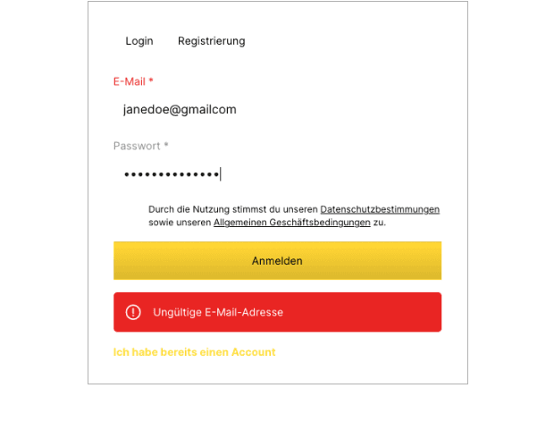
1.4.3 Contrast (Minimum)
Low contrast ratios hinder readability, especially for people with colour vision deficiency.
PROBLEM: The grey label 'Password' and the yellow link text ‘I already have an account’. (Not compliant for level of conformity A.)
PROBLEM: Not compliant for level of conformity A: The grey label 'Password' and the link text ‘I already have an account’.
SOLUTION: Improving the contrast ratio to at least 4.5:1 by changing the foreground colours (for level of conformity AA).
SOLUTION: Improving the contrast ratio to at least 4.5:1 by changing the foreground colours (for level of conformity AA).
PROBLEM: The yellow border of the input field, the red email label and the red error message. Not compliant for level of conformity AA/AAA.)
PROBLEM: The yellow border of the input field, the red email label and the red error message. Not compliant for level of conformity AA/AAA.)
SOLUTION: Improving the contrast ratios by changing the foreground colours. The contrast ratio of the border should be at least 3:1 and for the texts at least 4.5:1 (for level of conformity AA).
SOLUTION: Improving the contrast ratios by changing the fore-ground colours. The contrast ratio of the border should be at least 3:1 and for texts at least 4.5:1 (for level of conformity AA).
1.4.3 Contrast (Minimum)
Low contrast ratios hinder readability, especially for people with colour vision deficiency.
PROBLEM: The grey label 'Password' and the yellow link text ‘I already have an account’. (Not compliant for level of conformity A.)
SOLUTION: Improving the contrast ratio to at least 4.5:1 by changing the foreground colours (for level of conformity AA).
PROBLEM: The yellow border of the input field, the red email label and the red error message. Not compliant for level of conformity AA/AAA.)
SOLUTION: Improving the contrast ratios by changing the foreground colours. The contrast ratio of the border should be at least 3:1 and for the texts at least 4.5:1 (for level of conformity AA).
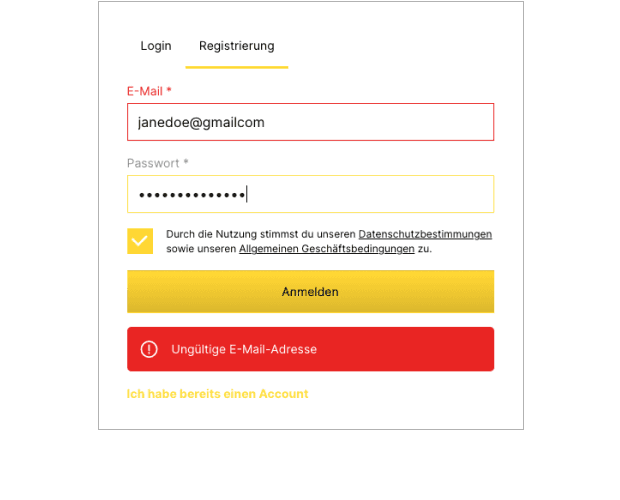
1.4.8 Visual Presentation
Small font sizes and low line spacing are difficult to read for users with visual impairments and screen reader users.
PROBLEM: The font sizes are difficult to read (12 px and 14 px).
PROBLEM: The font sizes are difficult to read (12 px and 14 px).
SOLUTION: The font size should be at least 16 px for important text on desktop. Using relative font units is a good idea, so that text sizes can be changed via browser settings.
SOLUTION: The font size should be at least 16 px for important text on desktop. Using relative font units is a good idea so that text sizes can be changed via browser settings.
PROBLEM: The line spacing of the text about privacy policy and terms and conditions is too small, which also makes it hard to read. (17 px with a font size of 12px).
PROBLEM: The line spacing of the text about privacy policy and terms and conditions is too small, which also makes it hard to read. (17 px with a font size of 12px).
SOLUTION: The line spacing for paragraph text should be at least 1.5 times the font size for good accessibility.
SOLUTION: The line spacing for paragraph text should be at least 1.5 times the font size for good accessibility.
1.4.8 Visual Presentation
Small font sizes and low line spacing are difficult to read for users with visual impairments and screen reader users.
PROBLEM: The font sizes are difficult to read (12 px and 14 px).
SOLUTION: The font size should be at least 16 px for important text on desktop. Using relative font units is a good idea, so that text sizes can be changed via browser settings.
PROBLEM: The line spacing of the text about privacy policy and terms and conditions is too small, which also makes it hard to read. (17 px with a font size of 12px).
SOLUTION: The line spacing for paragraph text should be at least 1.5 times the font size for good accessibility.

2.4.9 Link Purpose (Link only)
Non-descriptive link text is incomprehensible to users, especially if they use assistive technologies.
PROBLEM: In addition to the contrast problem mentioned above,
the link text ‘I already have an account’ at the end of the form is not immediately recognisable as a link.
PROBLEM: In addition to the contrast problem mentioned above,
the link text ‘I already have an account’ at the end of the form is not immediately recognisable as a link.
SOLUTION: An additional descriptive and underlined link text such as ‘Zum Login’ would be helpful for people with visual impairments or colour blindness and screen reader users.
SOLUTION: An additional descriptive and underlined link text such as ‘Zum Login’ would be helpful for people with visual impairments or colour blindness and screen reader users.
2.4.9 Link Purpose (Link only)
Non-descriptive link text is incomprehensible to users, especially if they use assistive technologies.
PROBLEM: In addition to the contrast problem mentioned above, the link text ‘I already have an account’ at the end of the form is not immediately recognisable as a link.
SOLUTION: An additional descriptive and underlined link text such as ‘Zum Login’ would be helpful for people with visual impairments or colour blindness and screen reader users.
3.3.1 Error Identification
The registration process offers minimal assistance with the input, which can be a challenge for insecure users.
PROBLEM: After entering an invalid e-mail address, no specific instructions are given in the error message. The error message is also not located close to the point at which the error occurs.
PROBLEM: After entering an invalid e-mail address, no specific instructions are given in the error message. The error message is also not located close to the point at which the error occurs.
SOLUTION: If an invalid password is entered, the user is informed of the specific error close to the error entered.
SOLUTION: If an invalid password is entered, the user is informed of the specific error close to the error entered.
PROBLEM: There is no guidance on how to create a secure password.
PROBLEM: There is no guidance on how to create a secure password.
SOLUTION: Providing details including icons on how to enter a safe password close to the input field.
SOLUTION: Providing details including icons on how to enter a safe password close to the input field.
3.3.1 Error Identification
The registration process offers minimal assistance with the input, which can be a challenge for insecure users.
PROBLEM: After entering an invalid e-mail address, no specific instructions are given in the error message. The error message is also not located close to the point at which the error occurs.
SOLUTION: If an invalid password is entered, the user is informed of the specific error close to the error entered.
PROBLEM: There is no guidance on how to create a secure password.
SOLUTION: Providing details including icons on how to enter a safe password close to the input field.
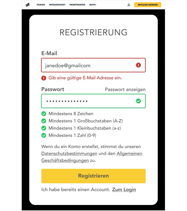
Registration after Redesign
Registration process after applying the WCAG.
CONTRAST: All font and background colours have a contrast ratio of at least 4.5:1, the UI elements have one of 3:1.
CONTRAST: All font and background colours have a contrast ratio of at least 4.5:1, the UI elements have one of 3:1.
FONT SIZE AND LINE SPACING: The font sizes are at least 16 px and the line spacing is at least 150%.
FONT SIZE AND LINE SPACING: The font sizes are at least 16 px and the line spacing is at least 150%.
LINK: The link text ‘I already have an account’ has been changed to a paragraph text and a short, descriptive link ‘To Login’ has been added. The underline is intended to make it easier to identify the text as a link.
LINK: The link text ‘I already have an account’ has been changed to a paragraph text and a short, descriptive link ‘To Login’ has been added. The underline is intended to make it easier to identify the text as a link.
ASSISTANCE WITH INPUT: The minimum requirements for a secure password are listed below the password input field. An error message about the specific input error is displayed below the input field. Icons also help people with colour blindness.
ASSISTANCE WITH INPUT: The minimum requirements for a secure password are listed below the password input field. An error message about the specific input error is displayed below the input field. Icons also help people with colour blindness.
Registration form redesign
Registration process after applying the WCAG.
CONTRAST: All font and background colours have a contrast ratio of at least 4.5:1, the UI elements have one of 3:1.
FONT SIZE AND LINE SPACING: The font sizes are at least 16 px and the line spacing is at least 150%.
LINK: The link text ‘I already have an account’ has been changed to a paragraph text and a short, descriptive link ‘To Login’ has been added. The underline is intended to make it easier to identify the text as a link.
ASSISTANCE WITH INPUT: The minimum requirements for a secure password are listed below the password input field. An error message about the specific input error is displayed below the input field. Icons also help people with colour blindness.
Thank you!
Thank you!
More projects coming soon.
More projects coming soon.
Thank you!
More projects coming soon.
Need a UX/UI Designer?
I'm a UX/UI Designer who specialises in accessible design.
I create user-centered solutions that make complex workflows simple and engaging.
My designs balance aesthetics with functionality, ensuring digital products work beautifully for everyone.
Design Thinking
User Research
User Flows
User Journey Maps
Persona
Wireframes
Prototyping
Accessibility